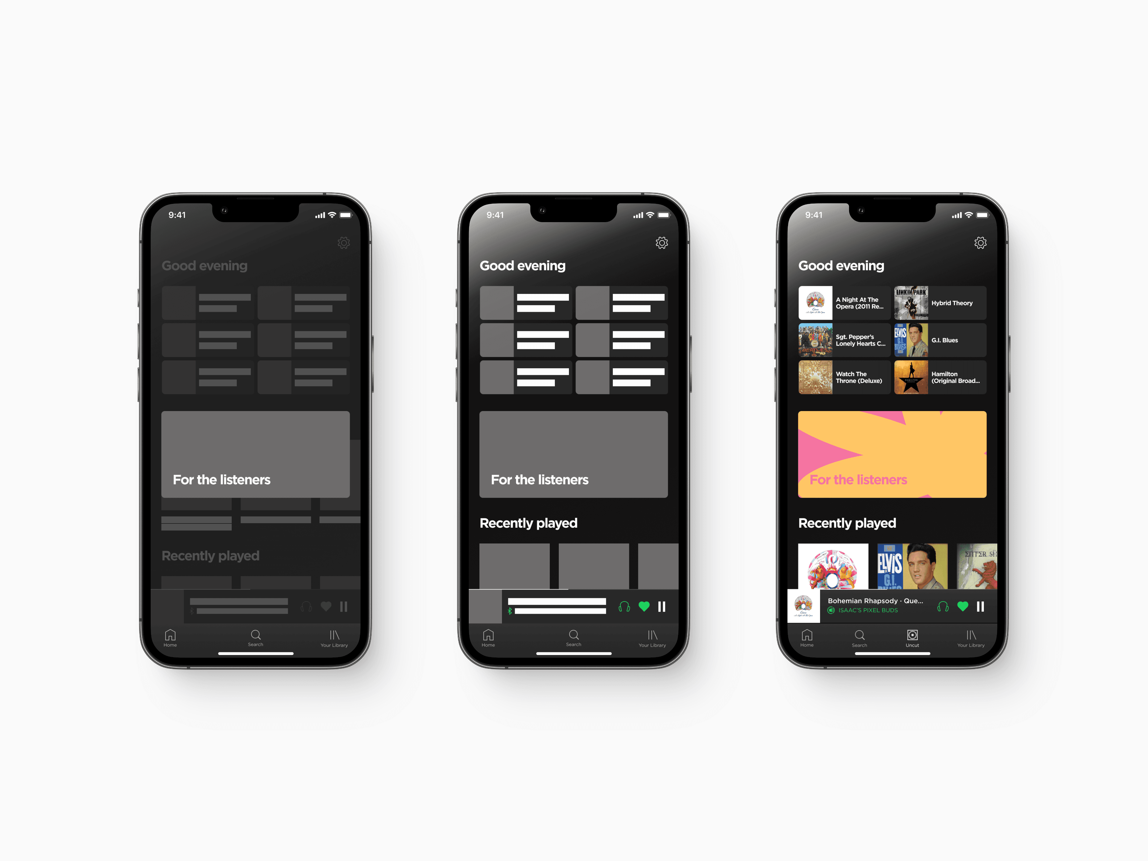
Spotify Uncut
June 2021
Description
Music should be listened to. Not just consumed. This is your chance to truly listen to music again.
Context
After COVID-19 and being in lockdown for the majority of the year, I realised that I had lost one of my greatest joys to the monotony of day to day life, listening to music.
Being at home 24/7 had made it normal to get up in the morning, go downstairs, sit at my desk, put my headphones, launch Spotify and begin work. Spotify would be on the majority of the day whilst I worked, whether it would be for music or podcasts.
At the end of 2020, Spotify sent out their yearly report, Spotify Wrapped. I was astounded by the figures. I had the most amount of hours compared to any of my previous 5 years on Spotify and it was by quite a margin. Spotify Wrapped also shows you trends in your listening which made me see that my music listening habits had changed through the year. I had stopped listening to most of the music that I had loved for years.
The constant listening had made me be on the search for new music to get that euphoric feeling of listening to music, my old taste in music had become desaturated. I had become determined to find new music through Spotify's variety of algorithms to look for something new. I missed that burst of emotion I used to get from listening to my favourite songs.
Spotify Uncut was created to bring back that feeling.
Challenge
Since COVID-19, people have been oversaturated with music from streaming platforms. We want a way for people to fall in love with music again. I tasked myself with the ambitious activity of designing a new feature of Spotify, so users could challenge themselves to really listen again.
Outcome
From the beginning of the project, the main outlook was to give users a way to enjoy music more and keep them more engaged with their listening experience. To do this, I needed to offer an experience that allows the user to feel like they are accomplishing a goal when they have finished listening, whilst also not making it too hard that they feel like it has become a chore to use Spotify. That's why users still had the choice to switch back to the usual Spotify app at any time through the navigation bar, whilst still being able to get their listening goals in for the day.
Based on the final round of testing, users enjoyed the experience of selecting what music they were going to spend their next few days listening to which is what I was aiming for; users scored my app a 8.5 on ease of use and 9.0 0n a satisfaction rating.
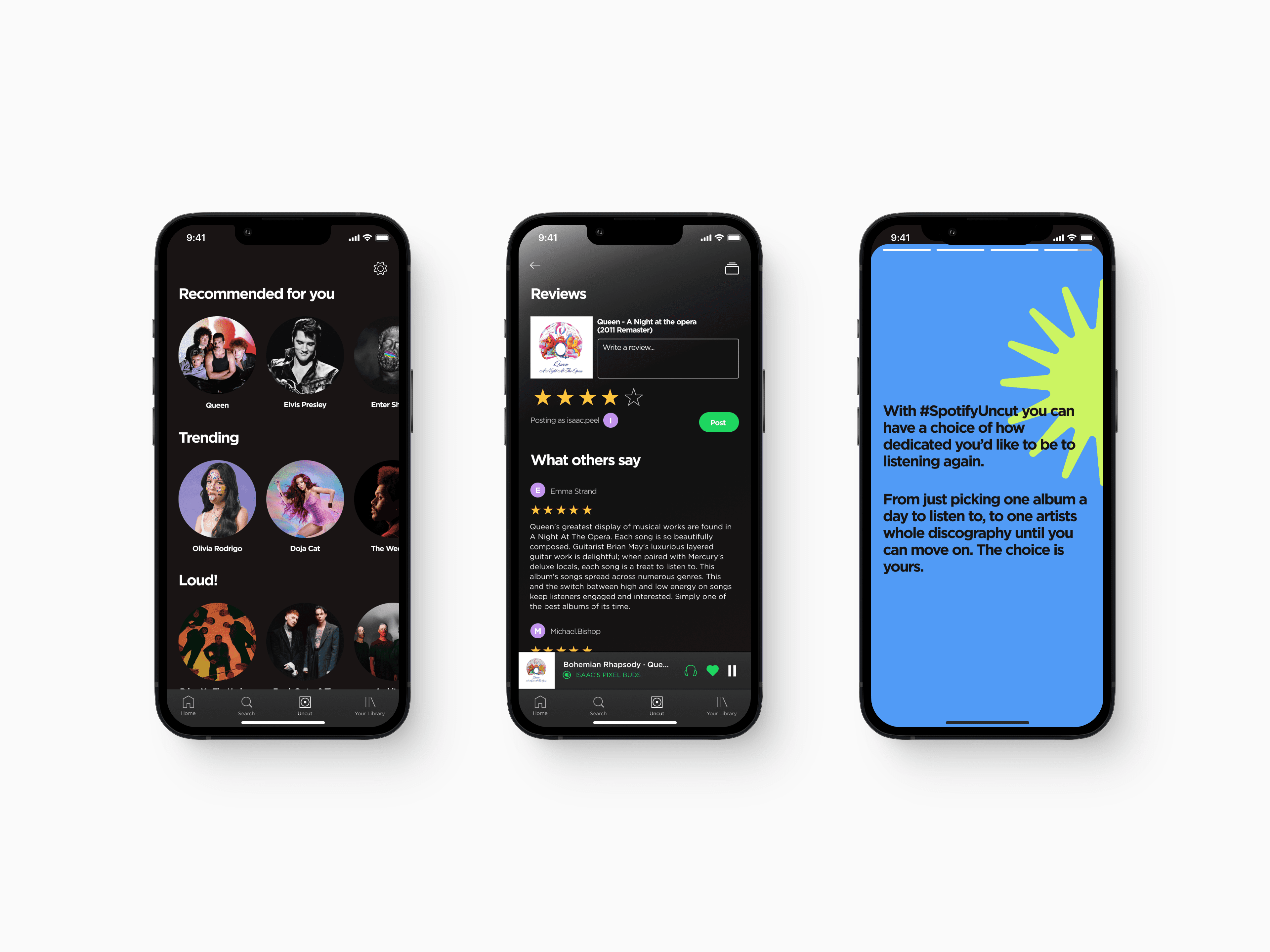
The design
Spotify has always had two major selling points: ease of use and features that aren't offered by their competitors. My challenge was to create a new feature for Spotify whilst fitting it into their ecosystem and making it blend well so that it offers users the same experience they have come to expect of from Spotify.
Introducing Spotify Uncut
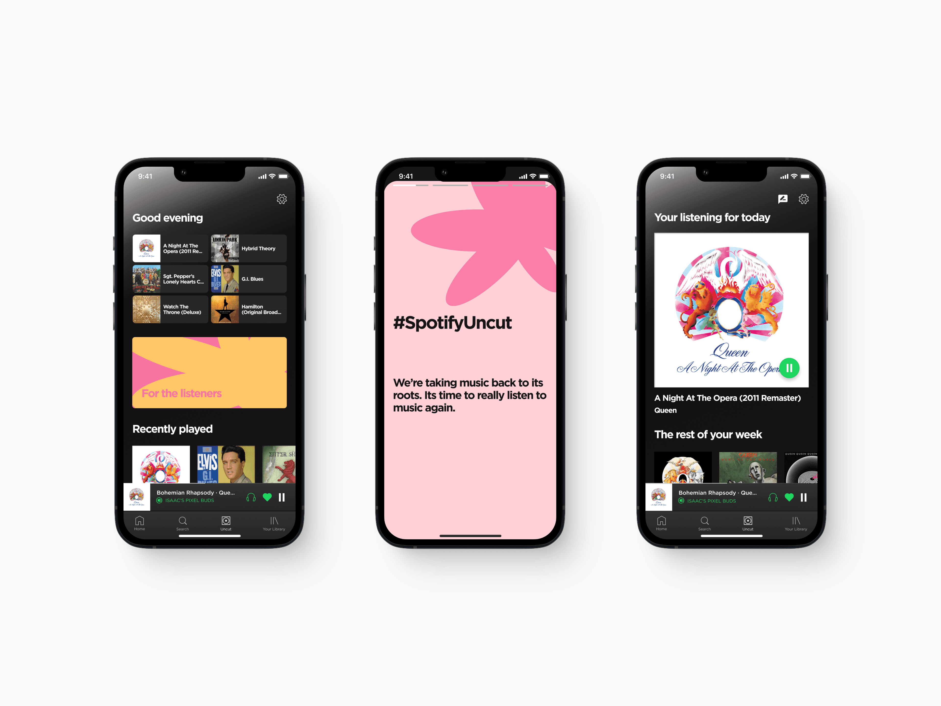
I know that users of Spotify are very comfortable with the way Spotify works and that they understood the way Spotify introduced new suggestions to them. I wanted to keep the users experience familiar with a story feature as this is how Spotify has introduced new suggestions to their users for the last few years. A story feature also allows big chunks of text to be broken down into easily digestible bites whilst also being interactive and quirky with differing illustrations.
The story allowed me to reassure and communicate to the user of what to expect from Spotify Uncut, how it works and how it can make their experience of streaming music more enjoyable and interactive.
The user's choice
The main idea of Spotify Uncut was to let users focus on the story artists tell in their albums, this needed to be possible without making the user feel trapped by their choice or become bored of the music they were listening to, to also meet Spotify's business goals.
Users have three choices of how they would like to listen to the artist they choose with each choice becoming gradually more challenging.
Comfortable: This option is for the users who know what they like and want to listen to their favourites uninterrupted. With Spotify Uncut, this would limit them to one album they can listen to a day without skipping songs.
Committed: The recommended setting. Users choose one artist a week they would like to listen to and can then choose whichever albums of the artists catalogue they want in whichever order.
Challenging: For the daring listeners. Users choose an artist they'd like to listen to, however, this time they are given the artists full back catalogue to listen to (in order)and can only move on once they have finished.
Reviews and community
After the first round of testing, it became apparent that users thought Spotify could benefit from a revamped community section to share thoughts on albums. The current community section is under utilised as it is only capable of sharing playlists amongst friends and seeing what other friends are listening to. I believe it could be made stronger by making it feel more like a community and less like a close friends list. Spotify Uncut is the perfect chance to introduce this feature.
The new community tab allows users to see what other uses think of the albums they were listening to thought. This also allowed a collection section to be built so users could track albums they reviewed and share those albums with others.
User interviews and affinity mapping
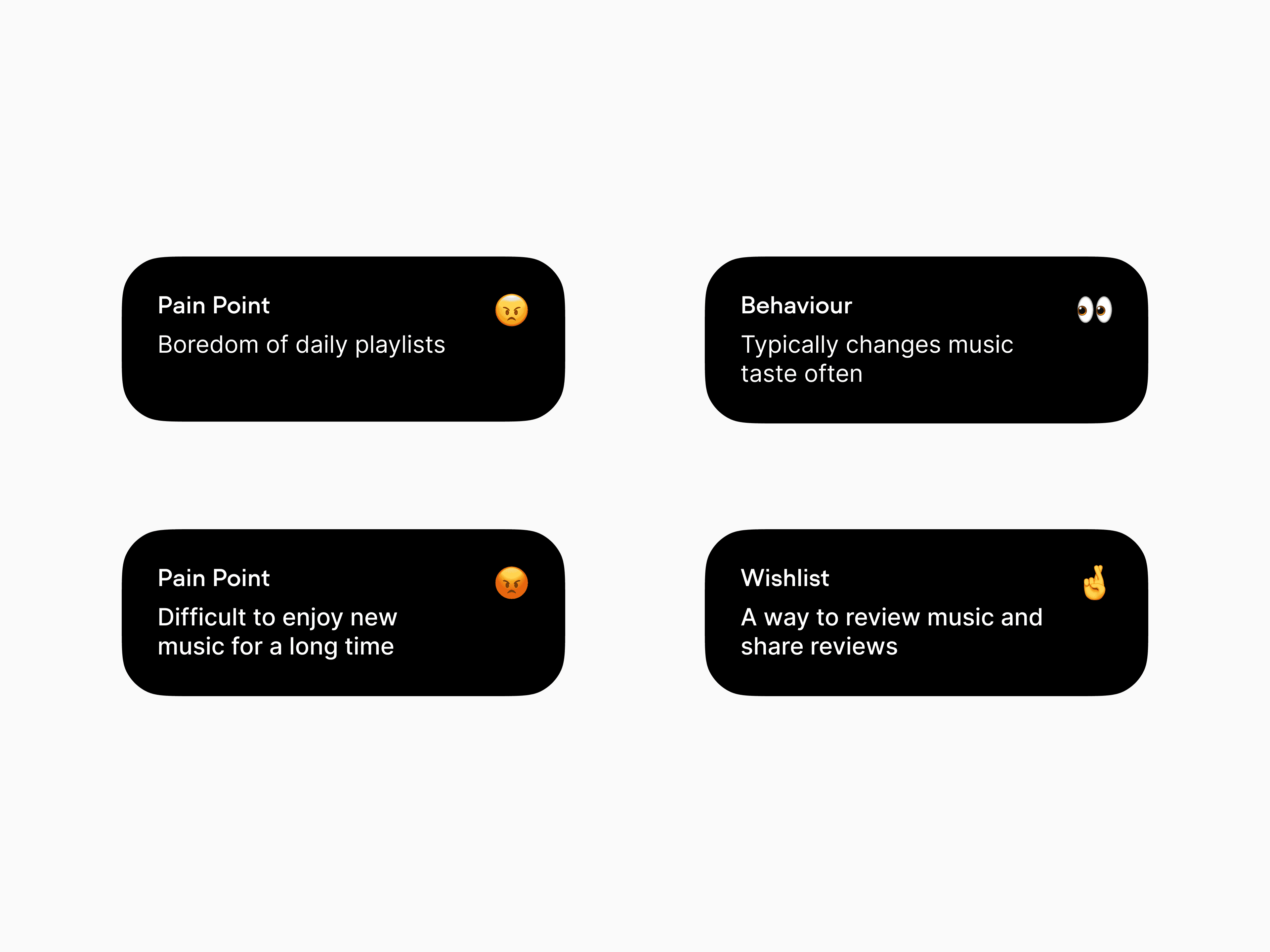
After interviewing 5 users who matched the target demographic (Millennials/Gen Z, music lovers) to learn how their listening habits have changed over the last year, what pain points they've encountered and what could make their experience more enjoyable with features on their wish list. I sorted through to create an affinity map of their wishes and pain points.
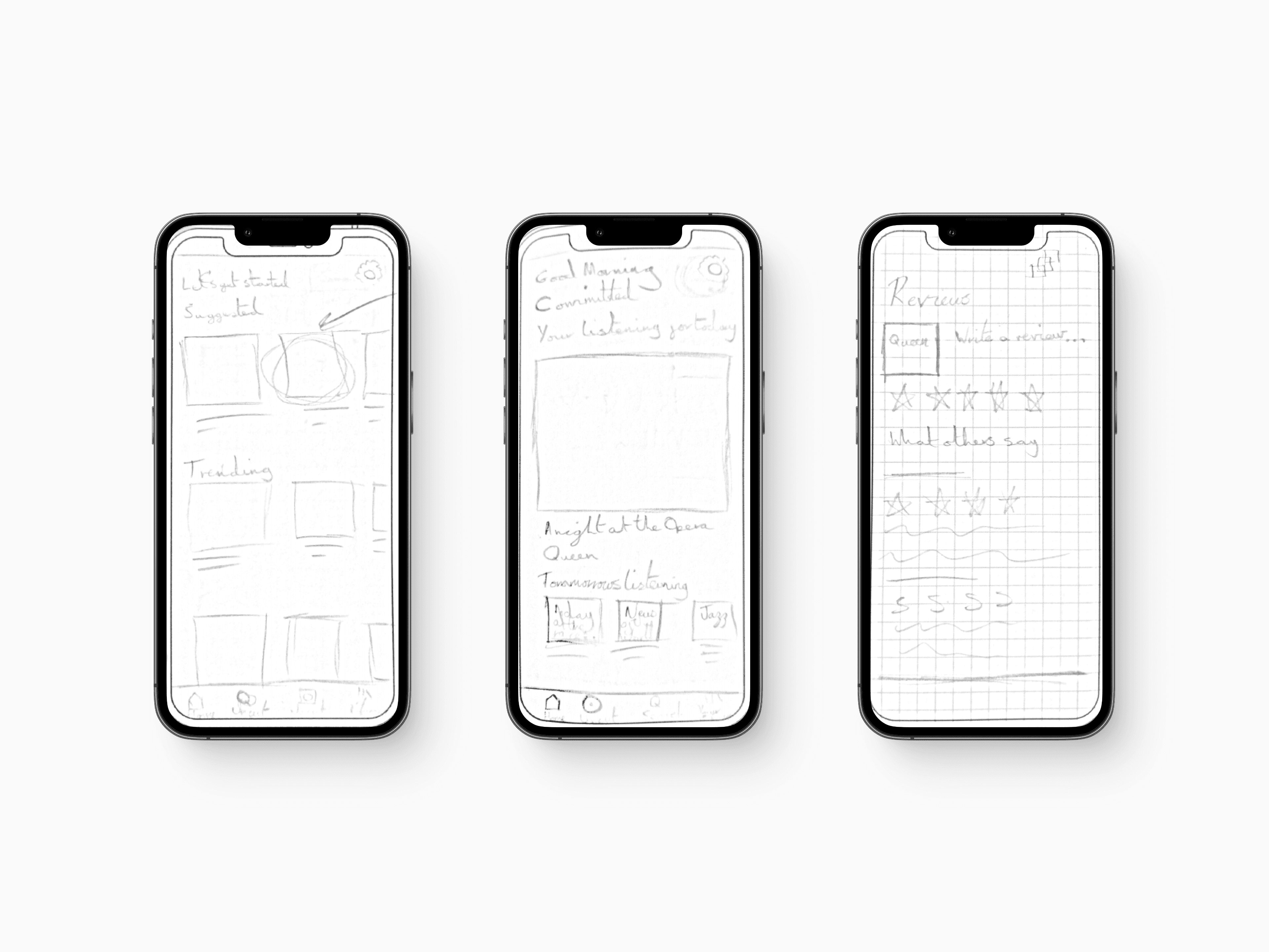
Design sketches
To gain a deeper understanding of Spotify's design system, i looked through their design guidelines (Design Guidelines | Spotify for Developers) which helped me know what cues should be used so that Uncut could fit seamlessly into the Spotify experience.
Key concepts:
Keep design consistent with Spotify for familiarity
Don't 'gatekeep' - nothing wrong with the traditional streaming experience
Make their choices clear but won't be punished for them
User feedback and iterations
Through two rounds of testing, I received multiple points of feedback that I went back and iterated upon to make the experience better. There were multiple points where the users felt confused by what was on the screen or overwhelmed by how much was on the screen. This led to their experience dwindling or skipping through screens with vital information that would help them make their choices easier so they needed to be redesigned.
