Getting people to care about their finances, without making it feel like homework
Product Designer & Researcher
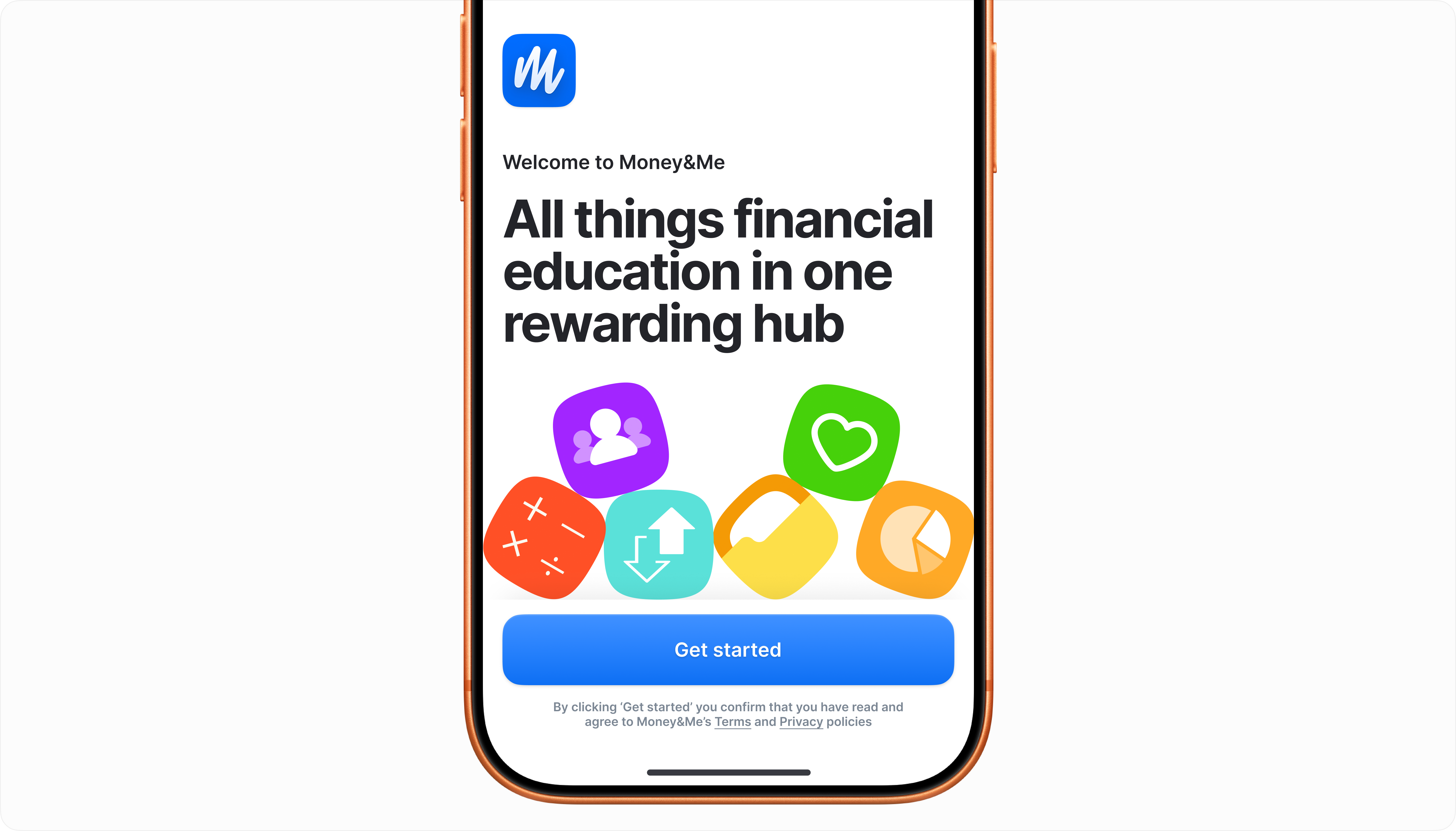
Money&Me is a financial wellbeing platform that employers buy for their staff. You log in and there are short modules, quick knowledge checks, webinars and a few tools to help you get your head around money.
Most of us were never taught any of this at school. The job was to make something people would open because they wanted to, not because HR sent another reminder.
Avoidance
01Most people only open a money app when something's already gone wrong. The car's failed its MOT, or the overdraft is creeping up. So the app arrives attached to a bad feeling, and then it greets you with words like drawdown and annuity. No wonder people close it and don't come back.
I've come to think of avoiding money as a kind of anxiety. Calling it laziness gets it wrong, and it leads you to the wrong design. Build for lazy people and you build nags and reminders. Show those to someone anxious and they feel worse.
of employees say financial concerns have affected their ability to do their job
hours lost each year from work absence driven by financial stress
So the brief was to build something people actually came back to, and our bet was gamification. Streaks, badges, a bit of friendly competition. The stuff that has people doing Spanish on Duolingo at 11pm to save a streak.
I was a bit wary of it, if I'm honest. Gamification is easy to bolt on and easy to get wrong. A leaderboard means nothing to someone who's embarrassed about where they'd rank. So before any of that, we needed to know who we were designing for.
Not everyone plays the same game
02I spent a while poking around Duolingo and Khan Academy, two products that have cracked getting people to come back. What jumped out was how differently people use them. Some tear through lessons to keep a streak alive. Others ignore the streak entirely and read every footnote. Same app, completely different reasons for being there.
We ended up with five archetypes, and I wanted every one of them to feel like the platform was built with them in mind. Nobody should have to use it "properly" to get something out of it.
The Sprint Learner
Progress-first. Gets in, completes modules fast, chases the next badge. Doesn't read optional content. Responds well to streaks and clear milestones.
The Deep Reader
Wants to understand, not just finish for badges. Reads everything, explores links, asks questions in webinars. Streaks feel irrelevant, gaining an understanding matters.
The Reluctant User
Only here because their employer said so. Needs low friction and clear value from the first minute. If it feels like homework, they'll drop out quickly.
The Anxious Improver
Motivated by worry, not curiosity. Knows they should be better with money but feels ashamed about where they are. Tone matters enormously.
The Goal Chaser
Has a specific outcome in mind — buying a house, paying off debt. Everything else is noise. Wants tools and targets, not theory.
Two things came out of this. First, the platform couldn't be a straight line. A sprint learner shouldn't have to read fifteen screens to earn a badge. Second, it had to reveal itself slowly, so a newcomer wasn't hit with everything at once.
We also added a Financial Fitness Assessment near the start. People are surprisingly bad at judging what they know about money. Some think they're experts, some assume they know nothing, and both end up reading the wrong stuff. The assessment did the judging for them. It placed people on one of four levels, from Novice to Expert, and picked up how they like to learn too, because that matters just as much as what they already know.
Ten navigation items
03We launched with ten items in the navigation. That's too many, and I knew it before testing told me. You don't need a law of UX to work that out. Look at a menu that long while you're trying to find one thing and you feel it.
So how did we end up there? Twelve weeks is tight. Late on, new requests came in from the client, and there wasn't time to think properly about where they should live. The quickest answer was always another nav item. Each one seemed fine on its own. By launch, the structure we'd planned so carefully at the start had fallen apart.
I don't blame the client for that. They had their own pressures. What we were missing was anything in our process that protected the information architecture once the late requests showed up. That's the first thing I'd put in place next time.
After launch I ran a closed card sort with nine people to see where things really belonged in their heads. Some of it was reassuring. Modules, account settings and webinars all landed where you'd expect. Employee Benefits was a mess. Nobody agreed where it went, which told me either the label wasn't saying enough or it didn't deserve a spot at the top level.
Webinars and Modules became Education. Sections that overlapped were merged, and labels were rewritten to say what was actually behind them. Ten items became six, and for the first time the nav matched how people thought about the platform.
Looking back
04Money&Me is live and the numbers are still coming in, so I can't tell you yet whether people keep coming back. I'll update this when I can.
The part I think about most is the navigation. The biggest problem on the project was never in the brief. It turned up one small request at a time while we were busy shipping everything else. I'm much quicker to spot that now, and much more likely to ask "where does this go?" before saying yes.
There's an irony in a money platform getting overspent by lots of small yeses. I've not forgotten it.